After my initial art book, I wanted to refine the narratives and images much more and de-clutter from the various images and descriptions, or story aspects that felt superfluous and detracted from the main focus of these narratives and the subversive elements that came with them. I worked towards a much stronger format both visually and in terms of the written content as well.
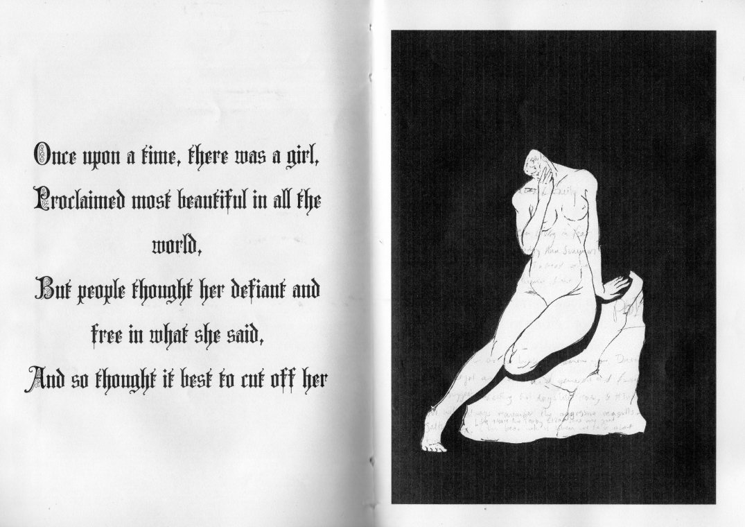
I felt that this composition worked particularly well in my previous art book/zine and so wanted to expand on this dramatic contrasting word and colour inversions across the pages and play on the dramatic impact of the image with my other mini-verses at the beginning of each story to head them. It also helped to refine the imagery and style of the art book overall and created clear definitions and visual signifiers and symbolic allusions for each narrative. I also really liked the style of using cut outs with stylised imagery on the black background.
I wanted the images to emblazon the story within itself but also work in a dialogue with the narrative created to expand on the themes and imagery created whilst providing an emblematic statement for each story.
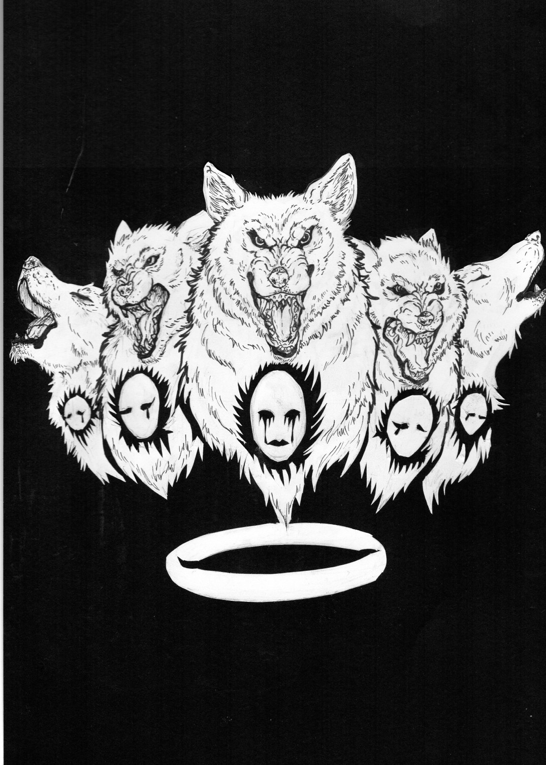
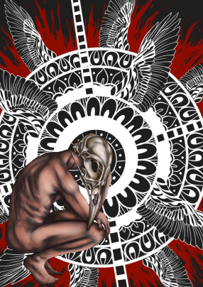
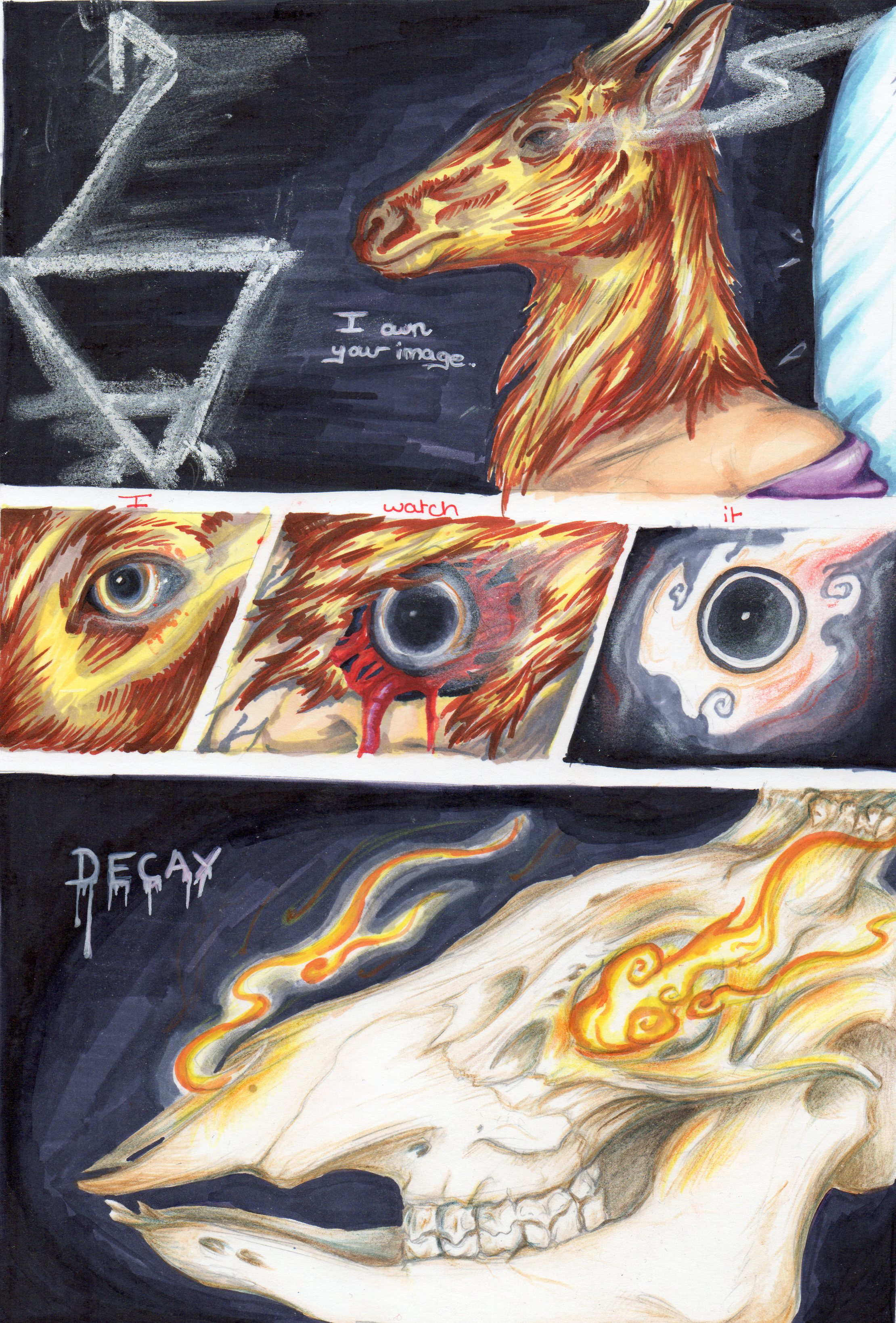
The Congregation
8.3 x 11.7″
Paper Cutting and stencil work mounted onto black with details in ink pen.
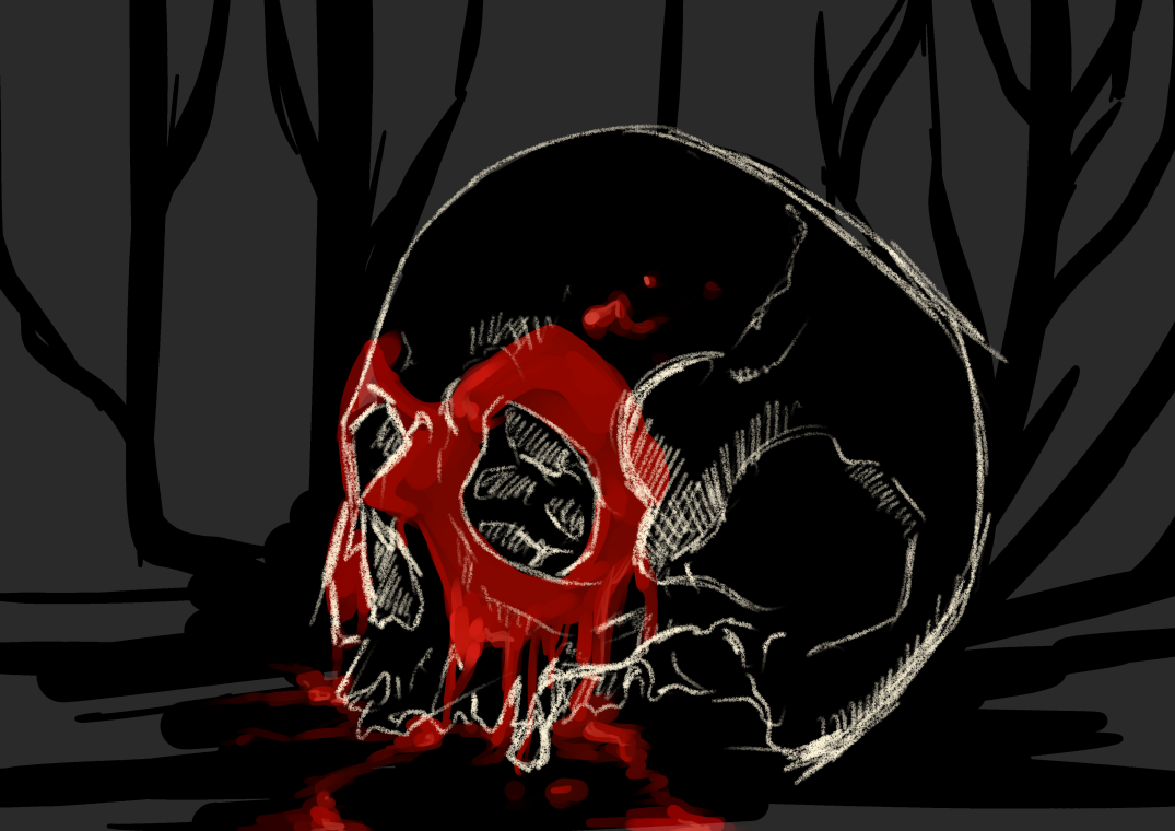
The accompanying piece for Lycanthropy: Werewolf in the Veins
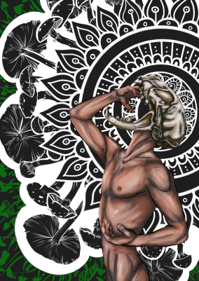
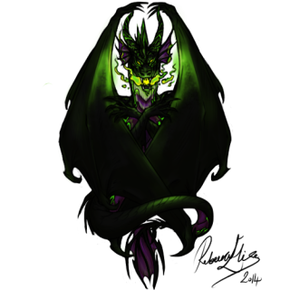
Pan
8.3 x 11.7″
Digital Painted cut out piece